FREELANCEFor me, freelancing is a rewarding way to make ends meet while keeping my design skills sharp.
I partner with a content designer and together we update sites for local businesses. It’s rewarding to be able to offer this service to my community and help them improve their online presence and build their brand.

Revival Vintage Eyewear
-
For this project, we were asked to take the current site and update it with our focus being centered around:
education around their mission and what services they offer
create a stronger brand presence in terms of colors, logos, photography, and voice
focus on a mobile-first experience since that was where most of their users were accessing their site.
We would eliminate the unused pages, simplify the experience, and create 5 entirely new pages.
-
I was tasked with being their product designer, brand designer, illustrator, and Shopify developer.
I worked with a content designer who also stepped in as photographer, SEO writer, and marketing strategist.
Really, just a dream team.
-
After meeting in October, we had a launch date for mid-December. Considering this was my first project where I had to dive into Shopify, a chunk of my time was spent learning the platform and being able to manipulate it as close as I could with my own designs.
San Diego’s only vintage eyewear store was in dire need of an update with their site. It was merely out of necessity they had a site, but they wanted to expand it into something that they could be proud of and potentially grow into an online store.

The initial passes at the designs required refinement on the sections. But so far, they were happy with the proposed rebranding.
This included updating their color palette, incorporating shapes that captured the 80s look they requested, and creating a library of brand assets like font, hero images, and tone. By creating a stronger brand presence, we
Pictured is the initial home page we were working with.
It featured an image with their address cut off, a picture of their showroom, and their instagram feed. There were many other pages filled with information and lots of copy that was outdated.
The hero image was the most important part of the home page and required many iterations.
Their online brand presence was fairly weak and we wanted to punch it up by showing their cool products and local customers. We were able to do a small photoshoot to capture the retro yet trendy vibe they wanted.
The lo-fidelity wireframes helped the clients conceptualize the ideal interactions for their new site.
Their ultimate goal was to educate potential customers what about their product and the simple process to get customized, unique frames. To achieve this, we wanted to show simple steps and value props right below the hero image. We also wanted to utilize headers and sections to help users digest the page easily.

THE FINAL PRODUCTThe homepage with a new hero image we could be proud of.
A key section that laid out their services in an easily digestible way (custom illustrations provided by moi!).
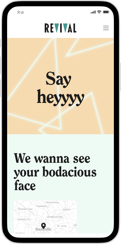
Branding not only lived in the colors and images, but also with their copy. Show off that 80s attitude we all adore.
I created an illustrated hero image for the sub pages that would give consistency to their site.


