CHECKOUT & TIPPINGRunning experiments to increase our effective rate for tips.


OVERVIEWGoFundMe relies on the generosity of donors to leave a tip with their donation to a fundraiser, this is how we made our revenue. As you can imagine, asking users for a tip must be done with integrity and sensitivity since most people are donating to funeral or medical fundraiser.
Tips are vital to our business but balancing user needs is important at this step in the process. Changing too much could greatly affect our numbers.

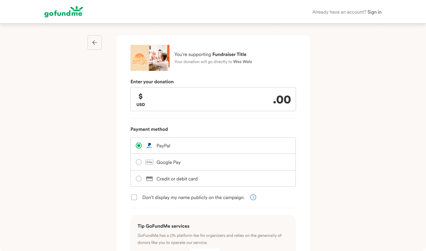
Initial checkout screens

THE PROBLEMThe world is a different place these days. Tipping culture has shifted and as we enter a recession, people are less likely to leave a tip, and we get it. We want to be sensitive to these needs.
Users often wrote into us asking about the tip. How do you emphasize the importance of GoFundMe in the world without putting a bad taste in people’s mouths over a few bucks? And who wants to leave a tip for a tech company? Where does a tip even go?
We wanted to take this opportunity to see if we can update tipping to help increase our business goals and maintain transparency with our users.
OUR GOALSBusiness metrics + user needs in harmony
Our biggest goal was to maintain or increase our numbers for tips, but we also wanted to ensure our users felt like we weren’t duping them into leaving a tip. A lot user sentiment was negative and if we wanted returning donors, we had make sure those who were tipping did it with intention.
Increase transparency
The key to any good user-experience is transparency. We wanted to increase visibility with tipping and make it clear that users were opting in to a tip. By making this a goal, we would decrease refund rates and keep our numbers steady.
Mobile-first focus
Previously, checkout was mainly viewed through the lens of a desktop experience. However, at least 72% of visitors donate through their mobile device. We wanted to address this when exploring new tipping experiments and focus on that user-base.

84% of donor inquiries are refund requests for their tip.

THE APPROACHBusiness metrics
To keep our tipping effective rate the same was simple but if we wanted to increase this rate and get more tips, then this would require a lot of monitoring and careful changes. This means exploring new options of the tipping interaction. Currently, it is a slider with default percentage amounts. We wanted to test out new interactions that are similar to other sites that ask for a tip (like Uber, Doordash, etc.).
Results on this experiment were promising, as it wasn’t too far from the current experience. This experiment also increased accessibility and mimicked other tipping interactions.
Transparency
Another one of our experiments focused on the hierarchy of the page, specifically on the mobile experience. Zooming out, we could see that some users may have trouble removing the tip from their donation since the summary falls far from the donation and tip amount. To edit to remove your tip if it wasn’t intentional, one must scroll all the way up to the page to remove it. A lot of refund requests stated that the users did not know that they were leaving a tip, they were confused.
By changing the hiearchy, we would hopefully allow for a better user experience and increase transparency on mobile devices.
The results on this experiment did maintain our numbers, users were able to opt-out easier but refund rates also decreased.
Mobile-first
With a mobile-first approach, we really put our focus on the interactions there and modeled desktop after mobile was redesigned. This helped change the way we examined the interactions and removed excess taps. It also helped us remove superfluous words and cut down on copy. With our mobile-first approach, we were able to really understand the most integral parts of checkout and how we can increase attention on the most important things.
The hope is to increase mobile conversion beyond our average conversion rate of 20%.

THE RESULTSCurrently, these experiments are still running. Considering the amount of A/B testing happening on checkout, it would take some time for the results to yield true numbers. We also know that the initial findings may not be the most accurate.
However, we did see positive gains on mobile traffic in which there was an effective rate (tipping) increase of >7% and conversion rate (completing checkout) also increased by .3%. There was also a decrease in refund rates.
The change in the hierarchy leads us to make the assumption that we can impact our business metrics by simply making improvements to the user experience rather than just creating new interactions. By decreasing the amount of clicks and increasing efficiency, we were able to make significant change to our numbers.
Future planning for tipping and checkout will continue to include mobile-first thinking and more explorations with the hierarchy.


